
A business website is essential. It is the cornerstone of your marketing efforts. We are going to address some recent changes in how Google ranks websites and the connection to building for mobile. We will also clear up some confusion about the terms mobile responsive web design and mobile first web design. Finally, we will give you actionable guidelines you can follow and a clear explanation of why every website must be designed for mobile.
A website is now essential. And it must be designed for mobile.
In the not so distant past, the phone book was the primary means of locating a business. A website was merely an afterthought. A website was cool and something that companies on the cutting edge would have. Today, a website is a requirement for doing business. And it must be easy to view on every screen size from laptops to tablets and most importantly smartphones. A mobile website is no longer recommended, it is required. This is not a matter of design preference. It can be a matter of lost visitors, lost leads and therefore lost sales.
61% of users are unlikely to return to a website on mobile if they had trouble accessing it. (Source: Google)
Users demand websites built for mobile
As users become more savvy and impatient, the percentage abandoning websites that are not built for mobile will keep rising. You do not want potential customers to have to pinch to zoom or have to turn their phone horizontal to view your website. Users need to have the best and most consistent experience possible on your website. A site that doesn’t deliver a mobile experience is a turn-off for a user and potential customer. We are going to explain the differences between mobile responsive web design and a website that is built mobile first.
First, we need to understand what the difference between a mobile friendly website, and a mobile responsive website. We will have you test your website to determine if it is ready for mobile users.
What is a Mobile Friendly Website?
Mobile friendly means your website will display on a mobile device, even though it was not originally designed to do so. This term is frequently to describe websites that are reasonably viewable on mobile. It is not a term used to denote how developers really build sites. When it is used in that manner, it is a bit of a misnomer.
What is Mobile Responsive Web Design?
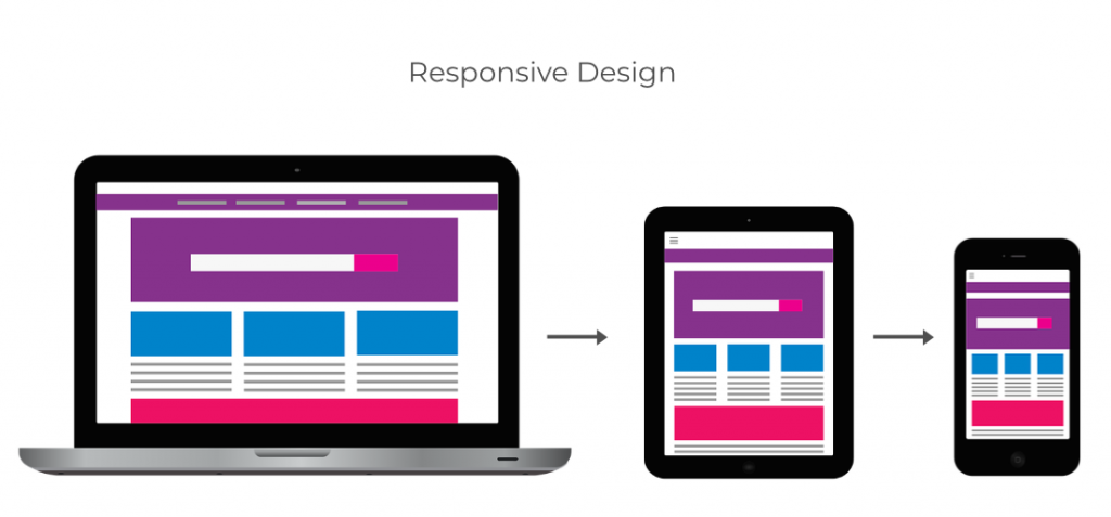
Mobile responsive web design is design that is built for a desktop platforms first, then designed to scale down to fit mobile devices. With many website building platforms, the developer can use built-in tools to see how the site will appear on a desktop, a tablet and on a mobile phone. Adjustments must be made so visitors to your website can view content correctly on their mobile devices. Images will likely need to be re-sized, font sizes will need adjustment and other formatting techniques will be used in order to build a mobile responsive website.
Also read: Why Website Speed Is Important
What is Mobile First Web Design?
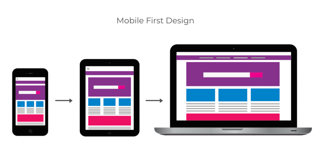
A website that is built mobile first, is designed to display properly on mobile, but also provides the best user experience on all devices. Mobile first web design is where the website is built for smartphone sized dimensions first, then designed for the larger tablet and laptop/desktop dimensions. This design takes into account that most website visitors will be viewing the website on mobile devices. So the designer starts with consideration to mobile instead of starting with the desktop dimensions. Again, changes to image sizes, adjustments in font sizes and other elements to the site are done by the developer to ensure that the site looks great across all platform sizes.
Is My Website Built for Mobile?
Open your website in a browser on your desktop. Now open your website on your smartphone or tablet then compare the two.
Do you need to rotate the phone to view the website in its entirety? Do you have to pinch and zoom the page to view a link? If any of these are true, then your website is is not built for mobile. It may be “mobile friendly” if you are able to navigate, but is that enough? The short answer is ‘no.’ Consider your experience with your website. Now consider your website visitors. How long will they stay on your website if they have to pinch and zoom to navigate their way around? They may just head over to the website of a competitor.
85% of adults think a company website when viewed on a mobile device should be as good or better than its desktop website. (Source: Comnio)
Now go back to the desktop version of your website. Take any corner and drag it to its opposite corner. If you start at the lower left corner, drag it to the upper right. What happens as you resize the window? Did the elements of your website rearrange themselves as the corner moved? If yes, then you have have a website that is built for mobile. To confirm this, look at your phone. Do all the elements you see look the same as those on the desktop, but just rearranged? If yes, this confirms that your website is built for mobile. A website built for mobile will not burden your visitors with pinching and zooming to view any part of it. Text should be legible without any interaction by your visitors.
Why Your Website Must Be Designed for Mobile
A website built for smaller screens is essential for the user experience, but did you know that Google has been working toward implementation of their policy to index only the mobile version of websites? That means when Google looks at your site to add it to their search database, they will look at the mobile version of your site. In the past, if you did not have a mobile site, Google would then default to the desktop version of your site. Beginning in March 2021, that is no longer the case. To be included in Google search, a website must be built for mobile,. Fewer search results may mean lost revenue. A site built for mobile is no longer optional. It is a requirement.
Also read: 12 Foolproof Signs Your Website is Outdated
Which is better for me? Mobile Responsive or Mobile First?
How your website gets to mobile can be dependent on a number of factors. Look over the factors listed below and consider the type of business, the type of data your site houses, and your target market. Also take a look at the analytics of your current website (if you have one) and consider how current user satisfaction may drive the decision. Ultimately, a consultation with a website developer can assist you in determining the best needs for your website and how best to build your new website or redesign your existing one. If you hire a website developer, he or she will take these factors into consideration when building your website.
Websites suited for mobile responsive website design
- A “heavy” or weighted down website with a lot of data will be slower to load on mobile.
- Your analytics show that access to your current website is mostly from desktop and future visits are less likely from mobile devices.
- A business-facing website with little to no access on mobile devices.
Websites that should be build mobile first
- Consumer-facing website with heavy visitation by users on mobile devices.
- A site with strong visuals that lends itself to the mobile format.
- Analytics for the current website shows visits from mobile are strong, but it has a high bounce rate. This may indicate low satisfaction with the current mobile website. A website built mobile first may present an opportunity.
